Discover Bank - CD Retention
UX/UI, User Testing, Prototyping

During my time at MCD Partners, I contributed to a project focused on improving the Certificate of Deposit (CD) renewal experience for the agency's top client, Discover Bank.
The product team was exploring whether introducing a promotional APY offer at the point of cancellation could increase customer retention. My role focused on building testable prototypes and summarizing user testing insights to evaluate this approach.
Role
UX/UI Designer
Timeline
May 2023 – January 2024
Hypothesis
Offering a slightly higher APY (4.6% vs 4.5%) at the moment a user attempts to close their CD will encourage them to stay.
My Role
Translated existing product designs into interactive Figma prototypes for usability testing (web + mobile)
Ensured flows aligned with Discover Bank’s design system and real product behavior
Acted as a dedicated notetaker during user testing sessions, capturing detailed behavioral and verbal feedback
Summarized findings and presented key insights and recommendations to internal teams and Discover
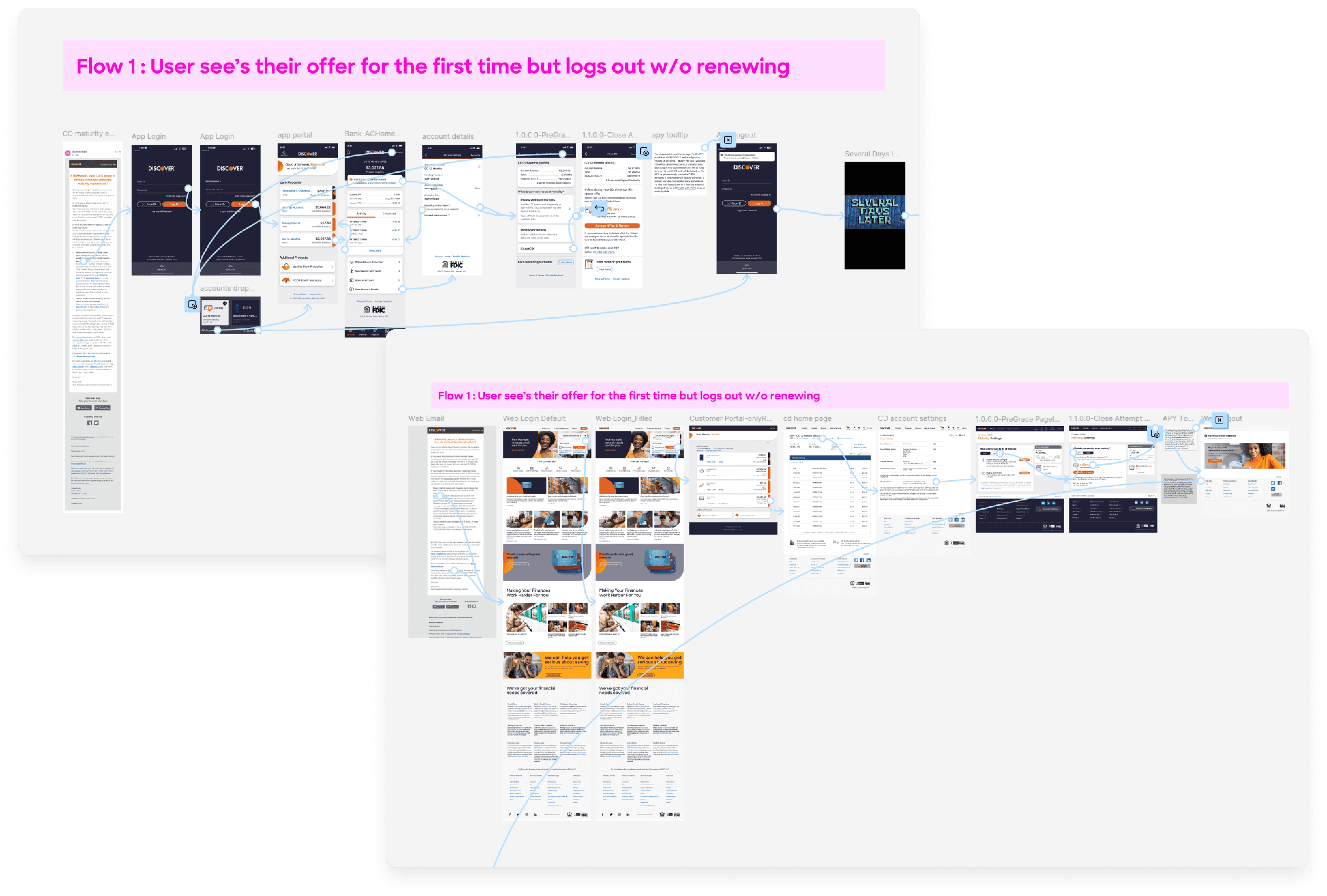
Building the Prototypes
An external research partner moderated usability sessions using prototypes built in Figma for both web and mobile.
Participants were asked to:
Log into a simulated CD account
Navigate to account settings
Attempt to close their CD
Encounter a promotional APY offer at cancellation
React to the offer and explain their decision-making
Log out and back in, then attempt to find the offer again
This allowed us to evaluate both:
Emotional response to the offer
Discoverability of the promotion
Prototypes Built in Figma
Key Findings
Offer felt misleading to users
Many participants expressed frustration that the offer was only presented after initiating account closure. Users felt they were being “baited” rather than rewarded.
The incentive was not strong enough
While some users said the offer might influence their decision, most felt that:
A 0.1% increase was not meaningful enough
The decision to leave was often situational, not impulsive
The offer was not discoverable
When asked to find the offer again:
Most users did not naturally return to the “close account” flow
Some only found it because they were prompted during testing
Many assumed renewal would automatically include the best available rate
Recommendations
Based on testing insights, I recommended surfacing the promotional offer earlier in the renewal experience, as many participants reacted negatively to the offer being hidden behind account cancellation and felt it was misleading. This approach was not pursued, as the business goal was to keep the offer as a targeted retention incentive.
I also recommended allowing the offer to remain temporarily visible after cancellation intent, as users had difficulty finding it again upon returning. This solution received a more positive response, as it improved usability while preserving the retention strategy.
Suggested Mockups


Impact
While I was not involved in final implementation, this work helped:
Highlight trust and transparency issues in the renewal experience
Provide user-backed evidence to inform product decisions
Shift thinking from “where to place an offer” → “how users perceive fairness and value”
Let's get in touch!
Like what you see? Feel free to reach out and let's get a cup of coffee!
Contact